Typically, companies start out by acquiring a great number of new users and then try to monetize them at a later stage. At a certain point, companies focus a great deal of their strategy on retaining customers, since the cost of keeping existing customers is substantially lower than winning new ones. This is where customer churn comes into play: It is a measure of how many customers are leaving the company. Churn modeling is a method of understanding the mechanisms behind why customers are departing and tries to predict it. In this tutorial, we’ll share how it can be accomplished in Python.
Understanding Customer Churn
What Is Customer Churn?
Customer churn refers to when a customer ends his or her relationship with a business.
Why Do Customers Churn?
Even though there are a variety of factors influencing churn, it mostly comes down to one of the following reasons:
- The customer is frustrated with the product experience.
- The cost for the product exceeds the value it provides.
- The product lacks appropriate customer support.
- Attracting the wrong customers.
Why Do We Want to Predict Churn?
Acquiring new customers can be several times more expensive than selling to existing ones. Understanding what drives churn and why customers are churning is crucial in maintaining high retention rates. Being able to accurately identify those customers at high risk of churning, may help us to create appropriate marketing strategies and retain our customers.
Data
The data can be downloaded from the following GitHub repository.
We’re dealing with customer data from a telecom company. The data has 7043 examples and 20 features including the binary target variable Churn.
Workflow
- 1) EDA- What data are we dealing with?
- 2) Preprocessing- Let´s clean our data
- 3) Training time- Model building and comparison
- 4) Predictions and Model Evaluation
- 5) Conclusions and Final Thoughts
Hands-On!
Enough talking, let’s jump right in by importing the libraries we need…
					## Basics
import numpy as np
import pandas as pd

## Visualization
import matplotlib as plt
import matplotlib.pyplot as plt
import seaborn as sns

## ML
from sklearn.model_selection import train_test_split,
cross_val_score, GridSearchCV
from sklearn.preprocessing import OneHotEncoder, StandardScaler
from sklearn.impute import SimpleImputer
from sklearn.pipeline import Pipeline
from sklearn.feature_selection import SelectKBest
from sklearn.compose import ColumnTransformer
from sklearn.metrics import accuracy_score,
classification_report, roc_auc_score, plot_roc_curve

## Algorithms
from sklearn.neighbors import KNeighborsClassifier
from sklearn.svm import SVC
from sklearn.tree import DecisionTreeClassifier
from sklearn.ensemble import RandomForestClassifier,
AdaBoostClassifier, GradientBoostingClassifier
… and the data:
					data_raw = pd.read_csv('https://raw.githubusercontent.com/lucamarcelo/Churn-Modeling/main/Customer%20Churn%20Data.csv', set_index='CustomerID')

## Split the data to create a train and test set
train, test = train_test_split(data_raw, test_size=0.25)
1. Exploratory Data Analysis-What Data Are We Dealing With?
Understanding what data we’re dealing with, will allow us to make better decisions about what preprocessing steps we need to apply, which classifier we’re going to choose, and how to interpret the results.
Looking at Data Types and Correct Those Wrongly Encoded
					data_raw.dtypes

## We have one variable that's wrongly encoded as string
data_raw['TotalCharges'] =pd.to_numeric(data_raw['TotalCharges'], errors='coerce')
Missing Values and Cardinality
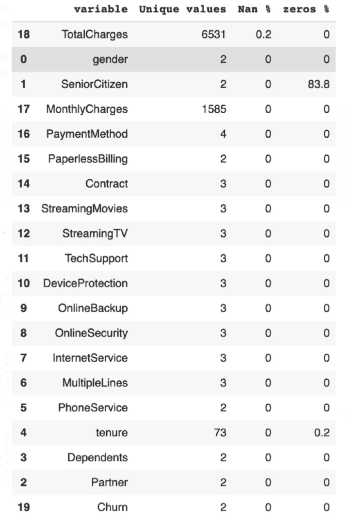
Cardinality refers to the number of unique values of categorical variables. The following function allows us to check for missing values, as well as cardinality.
					def missing_values(data):
  df = pd.DataFrame()
  for col in list(data):
    unique_values = data[col].unique()
    try:
      unique_values = np.sort(unique_values)
    except:
      pass
    nans = round(pd.isna(data[col]).sum()/data.shape[0]*100, 1)
    zeros = round((data[col] == 0).sum()/data.shape[0]*100, 1)
    #empty = round((data[data[col]] '').sum()/data.shape[0]*100,1)
    df = df.append(pd.DataFrame([col, len(unique_values), nans,  zeros]).T, ignore_index = True)
  return df.rename(columns = {0: 'variable',
1: 'Unique values',
2: 'Nan %',
3: 'zeros %',
#4: 'empty'}).sort_values('Nan %', ascending=False)

missing_values(data_raw)
- Output:
As you can see, there’s only theNaNsinTotalChargesthat we’re going to take care of in the preprocessing part. All categorical variables have a relatively low cardinality. This is important when choosing the encoding.
Distributions
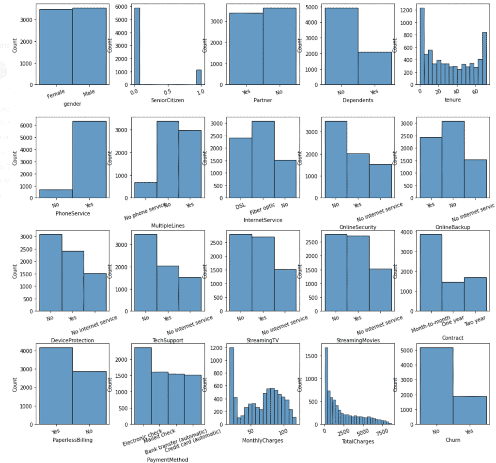
In Univariate analysis, we look at a single variable, while in bivariate and multivariate analysis we look at two or more than two variables, respectively.
Univariate analysis involves getting histograms of each of our variables. I like to solve this by creating a figure with all histograms.
					fig, ax = plt.subplots(4, 5, figsize=(15, 12))

plt.subplots_adjust(left=None, bottom=None, right=None, top=1, wspace=0.3, hspace=0.4)

for variable, subplot in zip(data_raw.columns, ax.flatten()):
  sns.histplot(data_raw[variable], ax=subplot)
- Output:
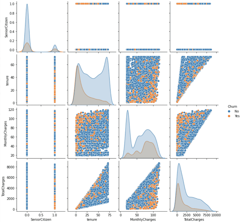
Bivariate analysis looks at how two variables relate to each other. This can be either two numerical, two categorical, or a mix of both variables.
					# Numerical-numerical variables

sns.pairplot(data = data_raw, hue='Churn')
plt.show()
- Output:
Having sethue='Churn'allows us to differentiate between churned and staying customers. We can see that churned customers tend to have a lower tenure while at the same time having higher monthly charges.
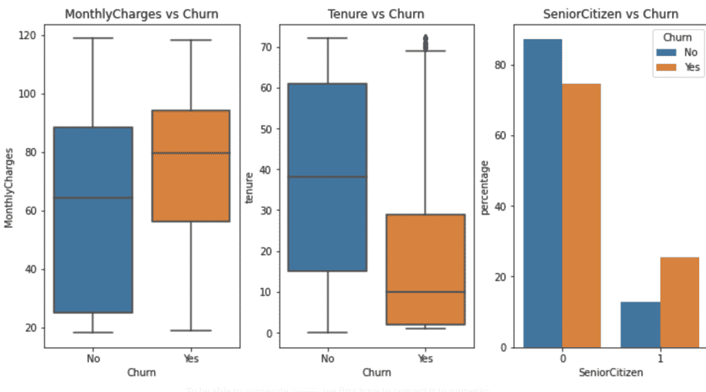
Let’s look at the relationship between categorical and numerical variables:
In our case, this would allow us to answer questions like “Are churned customers likely to get charged more?”, “When do customers churn?”, or “Are senior citizens more likely to churn?”.
Feel free to use the code block below to investigate your own questions.
					# Categorical-numerical variables
fig, axes = plt.subplots(nrows=1, ncols=3, figsize=(12, 6))

## Are churned customers likely to get charged more?
plt.subplot(1,3,1)
sns.boxplot(data_raw['Churn'], data_raw['MonthlyCharges'])
plt.title('MonthlyCharges vs Churn')

## When do customers churn?
plt.subplot(1,3,2)
sns.boxplot(data_raw['Churn'], data_raw['tenure'])
plt.title('Tenure vs Churn')

## Are senior citizen more likely to churn?
plt.subplot(1,3,3)
counts = (data_raw.groupby(['Churn'])['SeniorCitizen']
  .value_counts(normalize=True)
  .rename('percentage')
  .mul(100)
  .reset_index())

plot = sns.barplot(x="SeniorCitizen", y="percentage", hue="Churn", data=counts).set_title('SeniorCitizen vs Churn')
- Output:
Categorical-categorical relationships allow us to investigate how churn differs across, for example a specific product or different target groups. We’ll find answers to questions like “How does the churn across different services look like?”, “Are those receiving tech support less likely to churn?”, or “ Is a specific gender more likely to churn?”.
Use the following code to go through all the possible categorical-categorical variable combinations.
					for col in data_raw.select_dtypes(exclude=np.number):
  sns.catplot(x=col, kind='count', hue='Churn',data=data_raw.select_dtypes(exclude=np.number))
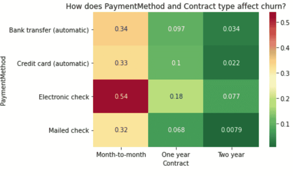
Lastly, we’ll quickly look at multivariate analysis — three or more variables. A good way to represent these relationships is heatmaps.
To be able to aggregate Churn, we first have to convert it to numeric:
data_raw['Churn'] = data_raw['Churn'].map( {'No': 0, 'Yes': 1} ).astype(int)
We’ll pick one example and explain how to interpret it. But the same applies to all other combinations of variables.
					# How does PaymentMethod and Contract type affect churn?

## Create pivot table
result = pd.pivot_table(data=data_raw, index='PaymentMethod', columns='Contract',values='Churn')

## create heat map of education vs marital vs response_rate
sns.heatmap(result, annot=True, cmap = 'RdYlGn_r').set_title('How does PaymentMethod and Contract type affect churn?')

plt.show()
- Output:
Conclusions From EDA
Now that we have a better understanding of what’s going on in our data, we
can already draw a few conclusions:
- Our target variable is not perfectly balanced. This is important when choosing
what algorithm and what evaluation metric we use. - Most variables in the dataset are categorical. We will need to encode them.
- There are a few
NaNsthat we need to impute. - Those paying by electronic check are much more likely to churn.
- It seems that those who have a month-to-month contract are more likely to
- Customers receiving tech support are less likely to churn.
- The ones that contracted Fiber are more likely to churn compared to those
with DSL. - It seems that
MonthlyChargesplay an important role in whether a customer will stay with the company or not. On the one side, customers that churn, pay on average almost 22% more. While seniors pay as much as 34% more on average – and that’s even 37% when they churn. SeniorCitizenare also more likely to churn and to stay longer.- The average
tenureis lower for churned customers.
2. Preprocessing- Let´s Clean Our Data
I’m pretty sure everyone has heard that Data Scientists spend about 80% of their time preparing the data. However, there’s a great deal we can automate and tricks we can help ourselves with. One of them is the use of a pipeline.
Creating a Pipeline
Our pipeline will consist of the preprocessing steps followed by an estimator at the end of the pipeline. This is a general convention since scikit learn’s pipelines will call fit_transform on all the pipeline steps except the last one, where it will only call fit. Depending on our requirements, we can for example include imputation, scaling, encoding, and dimensionality reduction.
Why use a pipeline for preprocessing?
- It prevents data leakage
Data leakage happens when we include information from the data we’re trying to predict during training. This happens for example when we calculate the mean for imputation for the whole dataset instead of only for the training data. Our performance estimation would then be overly optimistic. A pipeline makes it really easy to avoid data leakage, since we call fit on the training data and predict on the test data.
- It minimizes errors
With manual preprocessing, there are a lot more, smaller steps involved, and sometimes every variable needs to be done individually. A pipeline streamlines this process and minimizes the possibility of errors.
- Cleaner looking code
The pipeline is written once, and then we only need to call the corresponding method. As a result, the code is cleaner, easier to read. - Cross-validate the whole pipeline
Instead of cross-validating only the estimator, we can cross-validate the whole pipeline. The same applies to hyperparameter tuning.
Preprocessing steps in our pipeline
Imputation
We discovered a few empty strings in TotalCharges and passed them to NaN. We will use sci-kit learn’s SimpleImputer.- Scaling
Algorithms that measure distances between data
points work much better when the data is scaled. The idea is to make different
numerical ranges comparable to each other. We will use scikit-learn’s StandardScaler. - Categorical Encoding
We’ve previously seen that our dataset contains
mostly categorical variables. Since most machine learning algorithms do not
understand non-numeric data, we will need to convert them to numeric. Since all
the features have a very low cardinality, we will go with the OneHotEncoder. - Feature Selection
Our pipeline will also include a feature selection
part where we will only select the best-performing features. We’ll use scikit learn’s SelectKBest.
3. Training Time — Model Building and Comparison
Data Splitting
					train, test = train_test_split(data_raw, test_size=0.25, random_state=123)

X = train.drop(columns='Churn', axis=1)
y = train['Churn']
Building the Pipeline
					## Selecting categorical and numeric features
numerical_ix = X.select_dtypes(include=np.number).columns
categorical_ix = X.select_dtypes(exclude=np.number).columns

## Create preprocessing pipelines for each datatype
numerical_transformer = Pipeline(steps=[
('imputer', SimpleImputer(strategy='median')),
('scaler', StandardScaler())])

categorical_transformer = Pipeline(steps=[
('encoder', OrdinalEncoder()),
('scaler', StandardScaler())])

## Putting the preprocessing steps together
preprocessor = ColumnTransformer([
('numerical', numerical_transformer, numerical_ix),
('categorical', categorical_transformer, categorical_ix)],
remainder='passthrough')
Finding the Best Baseline Model
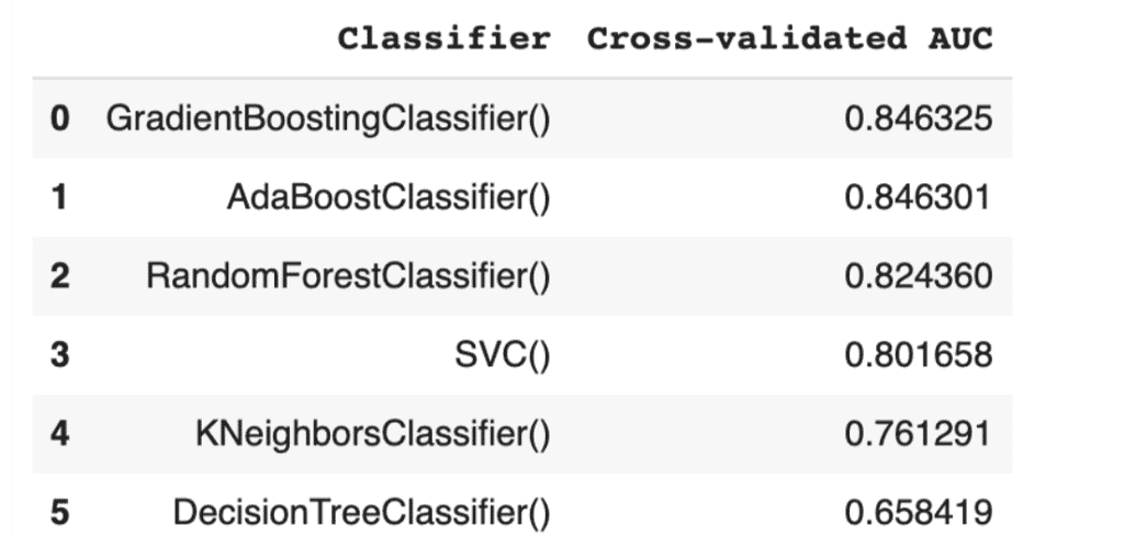
The idea is to find the algorithm that performs best at its baseline level, i.e. without tweaking, and select it to further improve it through hyperparameter tuning. We’re going to loop through different algorithms and see which one performs best.
					## Creat list of classifiers we're going to try out
classifiers = [
KNeighborsClassifier(),
SVC(random_state=123),
DecisionTreeClassifier(random_state=123),
RandomForestClassifier(random_state=123),
AdaBoostClassifier(random_state=123),
GradientBoostingClassifier(random_state=123)
]

classifier_names = [
'KNeighborsClassifier()',
'SVC()',
'DecisionTreeClassifier()',
'RandomForestClassifier()',
'AdaBoostClassifier()',
'GradientBoostingClassifier()'
]

model_scores = []

## Looping through the classifiers
for classifier, name in zip(classifiers, classifier_names):
  pipe = Pipeline(steps=[
  ('preprocessor', preprocessor),
  ('selector', SelectKBest(k=len(X.columns))),
  ('classifier', classifier)])
  score = cross_val_score(pipe, X, y, cv=10, scoring='roc_auc').mean()
  model_scores.append(score)
Now it’s time to compare the scores:
					model_performance = pd.DataFrame({
  'Classifier':
    classifier_names,
  'Cross-validated AUC':
    model_scores
}).sort_values('Cross-validated AUC', ascending = False, ignore_index=True)

display(model_performance)
- Output:
Hyperparameter Tuning
Now that we’ve identified our best candidate, we can go on to hyperparameter tuning. Essentially, this means finding the best “settings” of the algorithm.
Let´s get our final pipeline:
					pipe = Pipeline(steps=[
('preprocessor', preprocessor),
('selector', SelectKBest(k=len(X.columns))),
('classifier', GradientBoostingClassifier(random_state=123))
])
How Do We Know What to Tune?
We can change a lot of hyperparameters through the whole
pipeline. Are we going to try them all? No! Cross-validation is expensive and
we will therefore focus on a limited number of hyperparameters. We can get a
full list of all hyperparameters with pipe.get_params().keys().
The idea behind GridSearchCV is
that we specify the parameters and their corresponding values we want to
search. GridSearch will try all possible combinations and determines which one
performed best.
					grid = {
  "selector__k": k_range,
  "classifier__max_depth":[1,3,5],
  "classifier__learning_rate":[0.01,0.1,1],
  "classifier__n_estimators":[100,200,300,400]
}

gridsearch = GridSearchCV(estimator=pipe, param_grid=grid, n_jobs= 1, scoring='roc_auc')

gridsearch.fit(X, y)

print(gridsearch.best_params_)
print(gridsearch.best_score_)
- Output:
					{'classifier__learning_rate': 0.1, 'classifier__max_depth': 1, 'classifier__n_estimators': 400, 'selector__k': 16}

 0.8501488378467128
4. Creating Predictions for Unseen Data
					## Separate features and target for the test data
X_test = test.drop(columns='Churn', axis=1)
y_test = test['Churn']

## Refitting the training data with the best parameters
gridsearch.refit

## Creating the predictions
y_pred = gridsearch.predict(X_test)
y_score = gridsearch.predict_proba(X_test)[:, 1]

## Looking at the performance
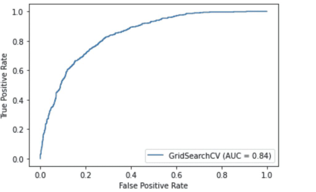
print('AUCROC:', roc_auc_score(y_test, y_score), '\nAccuracy:', accuracy_score(y_test, y_pred))

# Plotting the ROC curve
plot_roc_curve(gridsearch, X_test, y_test)
plt.show()
- Output:
					AUCROC: 0.8441470897420832
Accuracy: 0.7927314026121521
5. Conclusions and Final Thoughts
In this project, we’ve worked with customer data to get an understanding of the factors that drive churn. We’ve performed exploratory data analysis to understand which variables affect churn. We saw that churned customers are likely to be charged more and often have a month-to-month contract.
We’ve gone from the raw data that had some wrongly encoded variables, some missing values, and a lot of categorical data, to a clean and correctly encoded dataset by automating our preprocessing with a pipeline.
By comparing different classifiers, we selected the best baseline model and tuned its hyperparameters using GridSearchCV.
We were able to predict churn for new data — in practice this could be for example new customers — with an AUC of 0.844.
An additional step to further improve our model’s performance would be feature engineering — creating new features by combining or transforming existing ones.
You want to work on exciting IT-Projects? Then you can register here for the ElevateX-Community.


